
When you come to honestly think about it, conversions are the bread and butter of digital marketing.
No matter how much stock we put in traffic and engagement, it is the conversions that truly matter.
Yet conversions are not always that easy to attain. They will depend on a whole host of factors, and different pages need to be designed differently in order to maximize them, so it's not a coincidence that a lot of users are looking up web design in Sydney to reach their maximum potential.
Let’s explore how to design a high-converting homepage and why this design needs to differ from that of your product or service pages.
Homepage design – some key features

First of all, your homepage should always be treated as your most widely appealing calling card. While you may certainly want to attract different audience segments, your homepage should be able to target a general audience, and your product, service, and dedicated landing pages should be crafted for specific audiences.
Secondly, your homepage should find the right balance between sale and information – you don’t want to be too pushy here.
And finally, aim to make your homepage the absolute best it can be – chances are most visitors will see it at one point or another, so you want to wow them as much as you can here.
Now let’s jump into the design elements.
Your hero should be loud and clear
The hero section of your website is probably the most crucial one. After all, this is what visitors will see first, and they will base their impressions of your website and brand on it.
You want to strike a good balance between an illustrative image and a well-chosen tagline.
The image should be original (i.e., not a stock photo), and it should clearly show what your brand is about. What kind of services or products do you offer? How will they benefit your customers?
As for the tagline, it needs to be in line with both the image and the message you want to send. How are you impacting customer lives? How are you making them better? What problems are you solving?
Here is an example from Somnifix, which has done a great job of showcasing their solutions in the tagline, and the image complements the message nicely as well.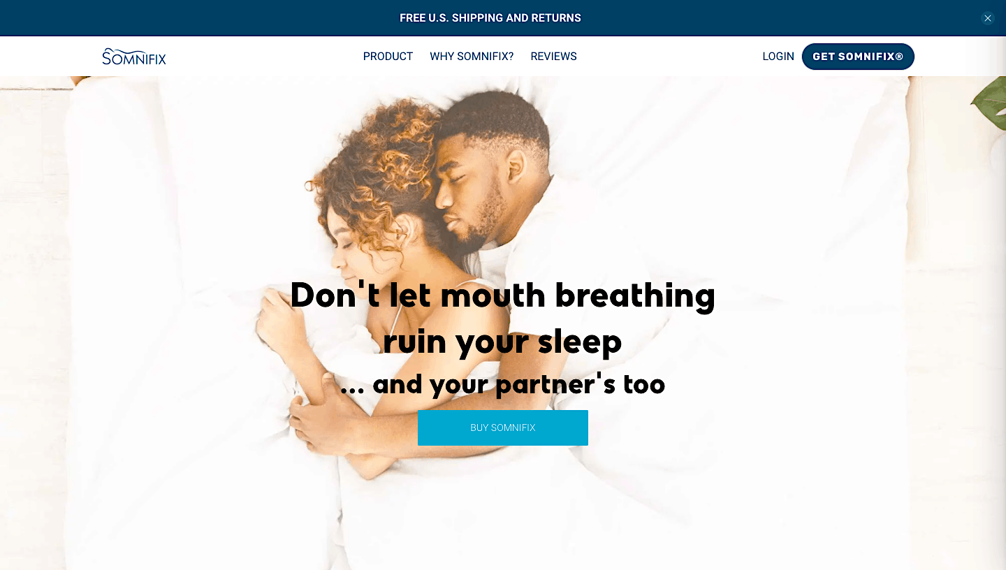

Keep it minimal
Since your homepage will necessarily have to carry plenty of information, you don’t want to make it too heavy in terms of design too.
The best practice you can reach for here is to utilize plenty of white space, and to couple and group similar elements of your design together.
You should also choose a color scheme and stick to it, and not distract your visitors from the message with flashy elements and imagery. You want everything to flow seamlessly and to tie into the theme of your brand.
If you’re selling a vibrant product (for example, trampolines), you want the website to reflect this fun and joy. If you’re selling mattresses, you want to emanate a feeling of serenity and calm.
Here is the example from Basecamp, which uses plenty of white space and plays with light tones and bold fonts very effectively.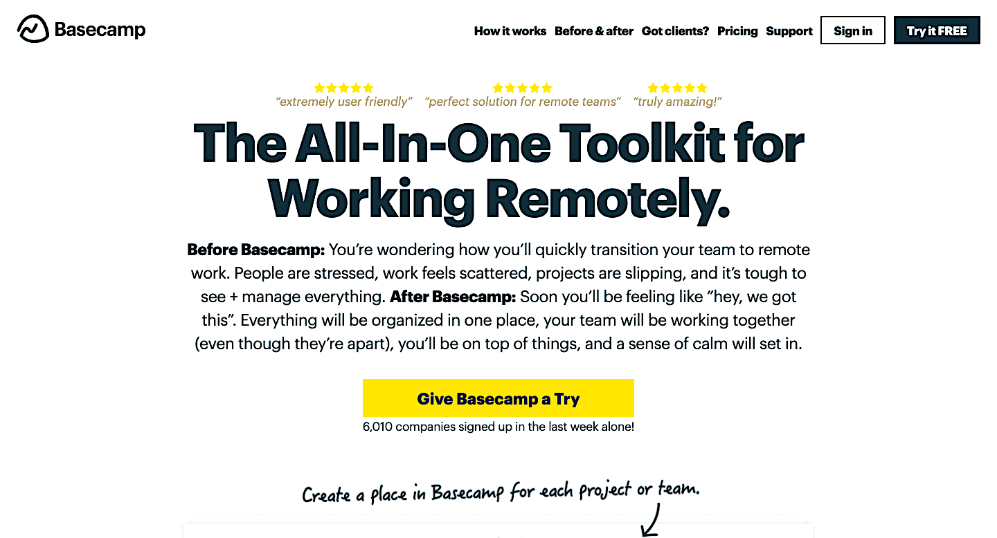

Highlight your most prominent features
You want your potential customers to instantly be aware of the most important features of your product or service. That’s how you’ll ensure they don’t have to keep scrolling and reading to realize what it is that sets you apart from others.
For example, if you offer free shipping, that should be stated as high up and as noticeably on the homepage as possible, without it being too much.
If you offer free training with a certain product, that too should be highlighted.
Try to boil down your offer to 4-5 key features. What is it that makes you unique? What are your unique selling points? What is it you really want the customer to know, that may help them convert?
These points should be distilled down as much as possible and featured on your homepage. Try to use words that everyone will understand and that clearly state the benefits of your offer.
Let’s look at the example from LFA Capsule Fillers, which has clearly showcased their features: money-back guarantee, free shipping, free resources.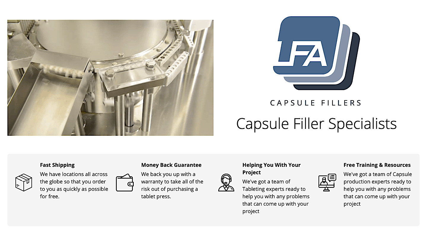

Don’t forget the CTAs
You’d be surprised to know how many brands forget to include a CTA on their homepage. And in fact, CTAs are a great way to boost conversions, especially if you use them correctly.
A CTA is more than just a sales gimmick. It is a reminder to your visitors that they can click here and make a purchase, sign up, or get in touch. The more strategically placed CTAs you have in place, the higher the chances of converting a lead.
There needs to be more than one conversion option on your homepage. So instead of adding one to the bottom of the screen alone, make sure there is one near the hero (or within the hero), then maybe one bellow every segment, and finally a very prominent one at the very end of your page.
Here is how Salesforce does it – unobtrusively, yet effectively. You have at least four chances of converting on a single page.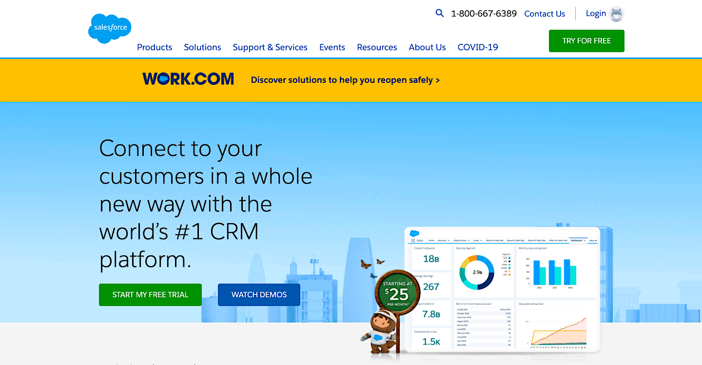

Remember the technical aspects
Finally, let’s just briefly touch on the importance of the technical aspects of your entire website for increasing conversions.
In order to not only rank well but offer a pleasant user experience, your website needs to load fast. If it takes ages to load all the features, users will just give up and leave.
Also, remember that you always need to make sure your homepage is mobile-friendly and that it shows up perfectly across different devices and screen sizes. So make sure you test for that too, and not just how well it looks on desktops.
Final words
Don’t forget the most important aspect of homepage design – target audience research and personalization.
No matter how well you design your homepage, if it doesn’t appeal to the kind of audience you’re looking to convert, it won’t be doing you too much good.