
“White spaces are designing gems….”
A perfect website design is a myth. What is ideal for you might not be considered for your audience or vice-versa. While designing a website, the designers and developers often connect for brainstorming sessions and come up with the best idea keeping their objectives and audience in consideration.
Website designing includes all from your color themes, choice of fonts, page layout, arrangement of various sections and elements, etc.; white space is another similar element that plays a vital role in designing. However, it is often overlooked and under-leveraged to its true potential.
Don’t you think so?
Well, if you belong to the “I don’t think so” category, then I hope you’re ready to change your perspective now. This article will take you through a journey of how the concept of white space came into existence and its importance and application tips in current designing trends.
So, without further ado, let's proceed.
What Are White Spaces?
The white spaces are the space/area between and within design elements, including typography glyphs. Now, the white space concept always brings along a series of doubts and confusions.
The most critical doubt/confusion being its name. Yes, that's right!
Often non-designers confuse the white space concept with actual “white-colored” space. But it isn't so. The white space in designing refers to any area around the designing elements. So it can be of any color, background image, pattern, texture. Anything!
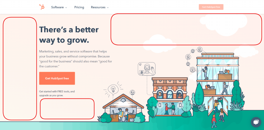
Let's take the example of HubSpot's landing page(see the image below). The highlights sections are all-inclusive in the white space. Also, the padding(spacing) between the text is a form of white space.

Sneak-Peek Into the Evolution of White Space Design Concepts (A Brief History)
The experts say that you should know what you're doing and why.
So I believe that before we dive deeper into the white space design approach, we should first take a step back and learn from the past about its origin.
Many designing concepts are classic and hold the same power even today, like selecting color themes that showcase the brand vision and attracting the viewer's interest.
Similarly, for white spaces, its traces are found in history as well. For example, in 1929, Jan Tschichold started a movement, namely, “New Typography.” This movement planned to bring the standard designing practices across the world. “White space utilization” is one of the four proclaimed principles of the campaign.
White Space: a Vital Web Design Element
“White space is the most controversial design element.
It is a highly recommended practice for a great user experience as per design theories. It is sought to enhance your website design's elegance and luxury factor by maintaining a proper balance between each design element, image, and text. Hence, improving the visual communication experience for the interacting users/clients.
However, on the contrary, the reality is a little harsh. Most clients consider White Space as “wasted space.” Also, they believe that too much white space can make their audience feel that something is missing, which is a solid concern to consider. And so, they believe in reusing the space for showcasing more visual elements. However, in such cases, the clients forget that too much information clutter is bound to bore their audience, resulting in poor user experience.

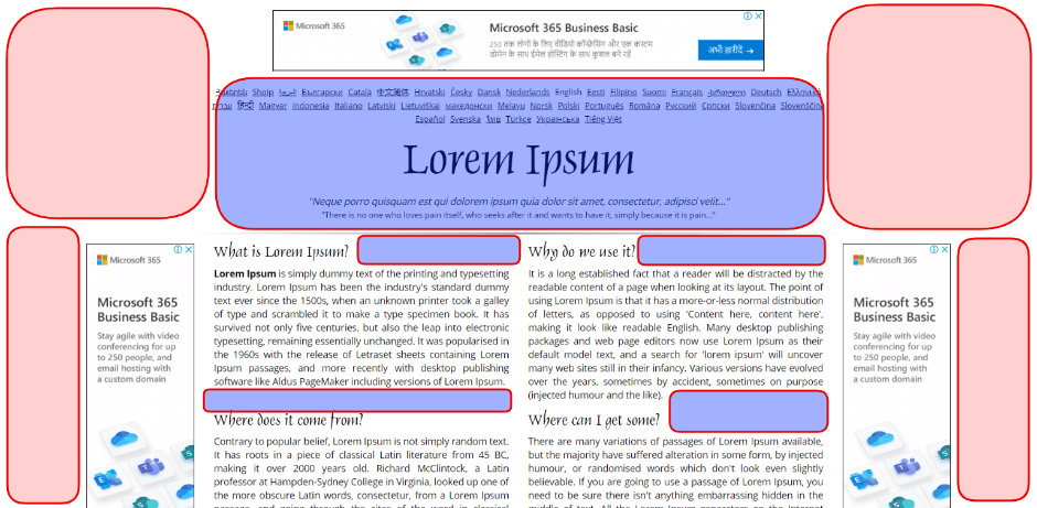
Macro white space highlighted in Red, Micro white space highlighted in Blue
Note: In the image shown above, the padding between the paragraphs and marginal area is also part of the micro white space design approach.
And, let's not forget that page experience and user experience is the dearest evaluation tool for Google. Therefore, playing with the user experience standards and cluttering wholesome information in a smaller space is like banging your head in a wall. Don't lose on your opportunities with such a mere designing fault.
Along with website plugins, white spaces are the most vital element as they hold power to boost/fail your website ranking through the page experience metrics. Moreover, white spaces also have several other benefits too like:
1. Easy-To-Use Webpage Design
The balanced white space improves the structuring and layout of other elements used in web pages too. Moreover, it makes it more convenient for the user to scan through the existing information and decide accordingly.
2. Enhances Visual Appeal
Adding white spaces improves the aesthetics of your website design by removing unwanted elements from your webpage. Visually appealing website design is vital to keep the interest of the site visitor intact. Also, a visually appealing website design records a higher rate of satisfying user experience than cluttered and crowded designs.
3. Quality Attracts More Than Quantity
The designers and clients who consider white space as a wasted space often forget that by adding up pop-ups, banners, various frames, and sliders, etc., they’re certainly adding up a lot of content that might be high on value for the reader. But they forget that the same high-valued content will be of no purpose if the reader isn’t comfortable with the readability of the text. And cluttered information is usually low graded on the readability scale.
That reminds me of the next point of discussion: how to know if your white space usage is just suitable for your web design? Well, this will be more clear to you when you'll be aware of the types of white space.
Types of White Space in Web Designing
The white spaces used in designing are not randomly placed elements. Instead, they are always used following the other designing elements. However, keeping one thing in mind, White Spaces are categorized into four types, namely, micro, macro, active, and passive white space.
This section will discuss each type of white space to learn more about its implementation.
1. Micro White Space
Micro white space, as the name says, is the smaller space around the designing elements. The margin between paragraphs, menu, grid images, etc., are examples of micro white space implementation.
This type of white space has a direct impact on the readability of your content. As the marginal area is minimum under micro white space design, the content appears closer or out of the regular padding space. That also results in the slower reading speed of the user, thereby affecting their reading experience.

2. Macro White Space
The Macro White Space approach focuses on enhancing the focal points of your webpage. It will help to balance different elements of your webpage to form a hierarchical flow for the user. Thus, further ensuring to guide the user's eye throughout the webpage's focal points.
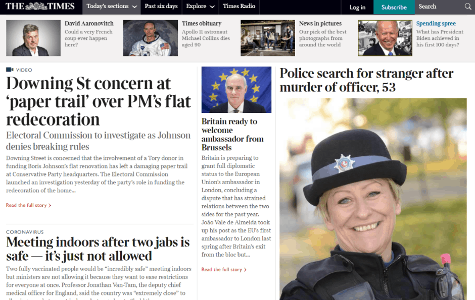
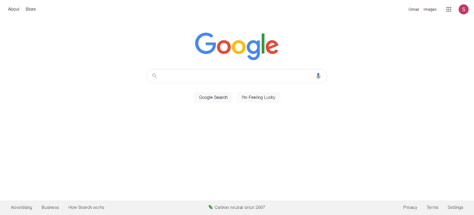
Google search’s homepage design is the classic example of the implementation of macro white space.

3. Active White Space
The sole purpose of using Active White Space is to avoid distractions for the user while on site. The Active White Space adds the area around the object/element to spotlight them. Moreover, it increases the point of attention and visibility of the object in view.
4. Passive White Space
Passive White Space surrounds the active space elements, ensuring the users' proper readability and navigation flow.
Note: The Active and Passive White Space always goes hand-in-hand to improve your web content aesthetics.
Factors to Consider for Utilizing White Spaces in Your Website Design
So, white spaces have time and again shown their importance in improving the user interaction rate for a website. Nevertheless, knowing about whits space types isn't enough. It would be best if you also considered the following factors while utilizing white spaces.
1. Focus-Orientation
Focus orientation is the essential factor. But, of course, who wouldn't highlight their objectives and visions, also their products/services?
In the designer's language, each website design has focal points. And strategic planning is required to spotlight the placement of textual and visual elements to direct visitors' attention towards those focal points. White spaces implemented around the focal points do it for you.

2. Legibility
White space affects the readability of your web pages too. Make sure to decide upon the type of white space after you're done with the typography elements like color themes, font style, font size, kerning, leading, and tracking. White Spaces show a visible impact when used with the following design elements –
- Typography
- Margins
- Images/ videos
- Iconography
- Composition
3. Branding
You must be thinking about how white space relates to your website's branding?
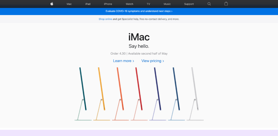
Well, it depends on the type of white space you use. Many designers have claimed to use a macro white space design approach to highlight the essence and luxury of their products/services. However, they feel that using ample space around the focussed element can grab more attention. For instance, Apple, a brand that doesn't require any introduction, uses a minimalist design approach with macro white spaces.
Summing Up!
The white space is an area between and around the various design elements used in designing a webpage. Its origin traces were found years back in the “New Typography” movement led by Jan Tschichold in the 1920s. This makes it a vital designing standard to be considered while designing the webpage.
Also, over time, the white space concept has evolved into four types wherein each white space type impacts the readability, legibility, branding, and layout of the web page text/images.
And now is the time to get your web design checked with proper white space implementation to render the best user experience to your audience and clients.
Author bio:
Himanshu Rauthan is an entrepreneur, Co-Founder at MakeWebBetter, BotMyWork, and the Director of CEDCOSS Technologies. He has worn many hats in his career – programmer, researcher, writer, and strategist. As a result, he has a unique ability to manage multi-disciplinary projects and navigate complex challenges.
He is passionate about building and scaling eCommerce development.
Email address linked with Gravatar account – himanshurauthan@cedcoss.com
Twitter profile URL – https://twitter.com/himanshurauthan
LinkedIn profile URL- https://www.linkedin.com/in/himanshurauthan/