

When users visit a website, their perception and understanding of it differ from that of a designer’s. The reason might be the disparity that lies between user psychology and your knowledge of it.
Everything in a UX design revolves around the psychology of the user – the colors, the images, the spaces, the visual sequence, the hierarchy, organization, call to action, motivation, and emotional call, and so on. People usually spend no more than two minutes and seventeen seconds on a website, given several factors like usability, accessibility, and functionality – all ingrained in the core of the UX design, so it's not a coincidence that many decide to hire a UX agency for handling those tasks.
As a designer, you must walk into the shoes of your primary audience and see your website from their perception. Even behind their visual ability, there is heavy psychology at play. Based on their understanding, users decide whether they want to interact with a website or not. Psychology becomes the driver of the user intentions, proceeding to their actions. With it, they establish the connection between their understanding of the website design.
While psychology rules the consumer choices, the convenience a website delivers also determines the effective use of the consumer mental map. If you tailor a website design as per the requirements of your users, you might see the users interacting with it or your brand with ultra-convenience. Sometimes, the psychology principles are ignored, and success is just not the case.
This article is the guiding light for those who want to begin their UX journey with a deep understanding of user psychology. Each of the principles walks you through some current examples to help you shape your design as per the user preference.
We’ll boil down the following in this guide:
Table of Contents
Why user psychology?
Let’s discuss why psychology scores as the most prized asset in the UX design first.

Why Is Psychology Important In Website Design?
Psychology provides the UX designer an incentive to step into the user’s mind and understand how they perceive different options and how they approach them. It allows you to understand the deep-set notions in the minds of the target and use these pain-points as an incentive for action.
However, the way you use psychology in design depends on how you manage to bring yourself to the level of your audience. Here, one psychological factor triggers another, and you get a chain reaction. Using a collective of users’ emotional, mental, and psychological cues can allow your visitors to see what they expect.
Here are some other benefits that successful implementation of psychology leverages your website design:
- It helps improve the overall user experience on the site.
- It can increase the overall traffic on your website as people love sharing sites to which they can personally relate.
- Using consumer psychology can help increase sales and the overall revenue of the website due to consumer satisfaction.
- The relativeness of content and ease of use helps the viewers put their trust in the brand.
- The psychology-embedded UX will keep your viewers around while you can experiment without losing the appeal.
While the superficial benefits of psychology can earn you the big-ticket to successful website design, several aspects help you obtain the recognition your website deserves from its visitors. Pick any site from a giant and notice the ease of access, functionality, ease of interaction, and the overall appearance. The psychology principles might be invisible at the moment, but paying attention can help you gain an understanding of what users want from you.
Down below are the principles of psychology every UX designer – whether beginner or professional – must hardwire in their practice.
Principles Of Psychology In UX Design
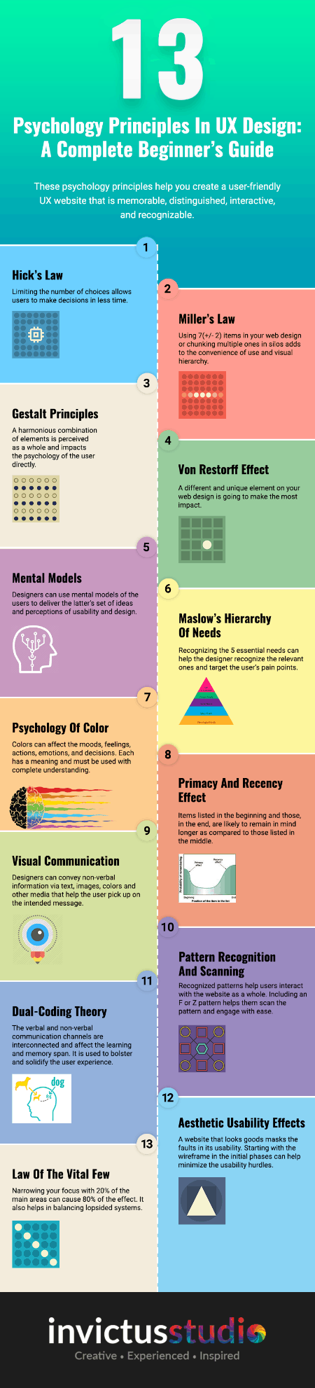
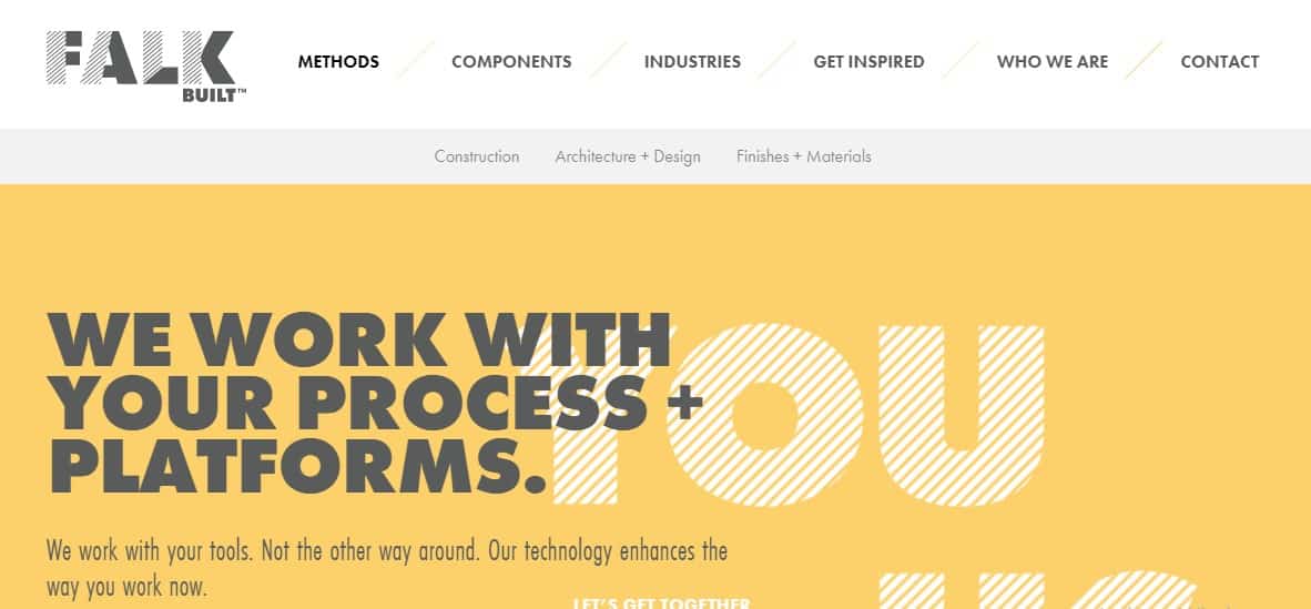
1. Hick’s Law
Hick’s law states that the time you take to make a decision increases with the number and complexity of choices. The time for decision-making depends on the number of choices provided. Simple choices make it easier for you to choose your preferred option in the least time period. On the contrary, exposure to a variety can result in taking longer than the usual time to make choices.
The case of the UX website design is the same. The connection between time and choices become evident when a designer implements Hick’s law in his designs. A smart adherence to this principle will allow him to simplify the complex decisions and narrow them down to ease access to information.
When users are presented with few but precise choices, they tend to navigate their way quickly through the website. With fewer options, decision-making will require less time, actions will be quick, and more conversions will result.
Falkbuilt’s website eases the user’s stress as they browse through minimal choices.

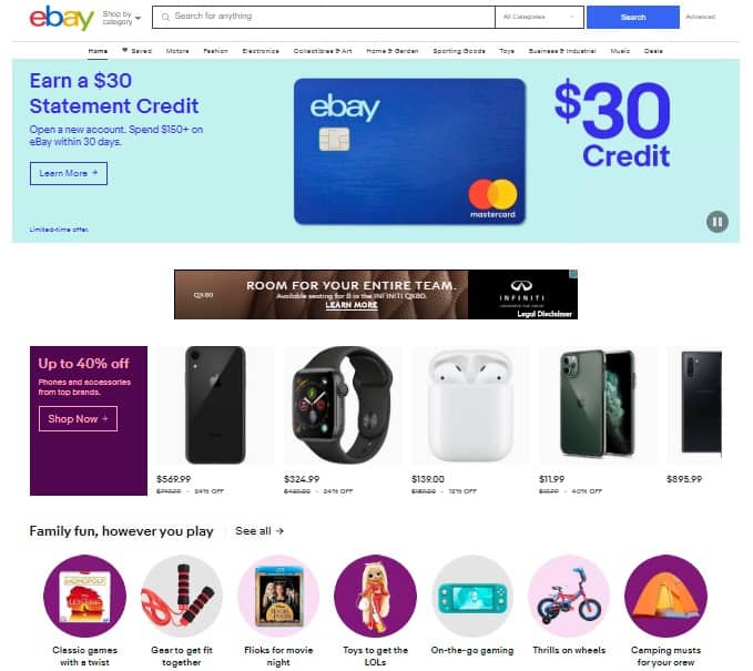
2. Miller’s Law
Humans are visual creatures who are likely to keep the information stored in their memory banks. But George Miller put forward an interesting theory. According to him, an average person can retain as much as 7(+/- 2) items in his memory at a time.
As per this rule, the numbers ranging from 5 to 9 will have an optimum effect on the memory of the user. The designer, however, is responsible for shaping and arranging the elements to enhance user experience. And the best way to convey the right information to the users is via chunking.
Instead of using 30 or 45 items scattered around the webpage, chunking them in an arranged order of 5 will help the users navigate their way automatically. Just keep in mind that the users are expecting relevancy in each group and want to view the items as a part of the whole category.
A great example of chunking is displayed at shopping websites like eBay that make it convenient for the user to sort through the items of their preference in the designated chunks. Also, it gives a sense of arrangement and harmony.

3. Gestalt Principles
To understand the Gestalt principles, consider these examples. A group of trees will be a forest. A group of wolves would be a pack. Drops of water will make up an ocean. We would consider the individuals as a part of the whole despite their individuality.
The same applies to a website. When we see a website, we don’t see fonts, images, colors, text, or design. We see a collective identity that’s made up of the harmonious combination of these elements. This theory applies to all design mediums at all levels.
However, these principles have a high impact on the cognitive perception created by the human mind. These help the brain form its visual stance and develop the imagery. Gestalt principles comprise of six categories:
- Figure and Ground
The figure and ground can be understood in terms of an object and its surroundings. Both of these interact, complementing each other to create a variety of images and perceptions.
- Proximity
The elements placed close to each other will be considered as a group regardless of their relevancy. Proximity can be best related to chunking due to placement and categorization.
- Symmetry and Order
Symmetry equals a balanced state where each element is placed in an order, giving a sense of content and relief to the viewers. More often than not, orderliness and the hierarchical arrangement seems aesthetically pleasing.
- Similarity
In continuance of the proximity rule, similar objects placed close by will be perceived as a group or a single unit too.
- Closure
Our brain traces the invisible lines that complete an unfinished image or object, so the figure appears whole in our perception. Using its intelligent assessment, the brain recognizes the hidden message inside the design.
- Continuity
Along with closure, the brain recalls previous experiences, motivating the eyes to continue recognizing the patterns of completion. From object to object, the linear model is established via a consistent path.
4. Von Restorff Effect
Do you remember an image in which one distinct and unique element becomes the most noticeable and recognized element? Von Restorff Effect or the isolation effect is used in the UX practice to emphasize the crucial information bits or even encourage the users to act.
As much as the name sounds unfamiliar, the concept is widely explored in the form of CTAs used around the web. It could also be a text, image, or any the content piece that stands out among the rest and attract the attention.
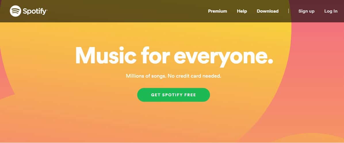
In the screenshot below, Spotify displays a clear example of the Von Restorff Effect. The green button is an indication that action needs to be performed.

5. Mental Models
As the term indicates, a mental model represents a set of thoughts and perceptions, and an individual intuitively constructs using his experiences and expectations of the real world. A mental model helps the user make intelligent decisions. Using their cognitive methods, they recognize how an object or system works.
When interacting with a website, users look for means to communicate and expect results as per their mental models. If they see something that doesn’t fit their understanding, they might find it difficult and confusing, and hence leave the website.
For that reason, you need to match their mental models and make the user experience easier for them. It could include various elements in a website, such as simple navigation, interactions, terms, and ease of access suiting to their skills.
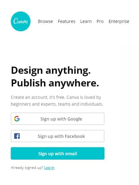
The common examples include top-bar navigation, links underlined in blue, the logo design on the extreme corner (either left or right) at the top, a search bar, signup forms, and so on. Here’s an example of Canva’s signup/login form that ultimately picks on the mentality of its users. It provides a login form along with a registration option where the new users can easily find their way to using the website.

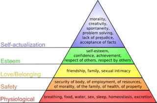
6. Maslow’s Hierarchy Of Needs
Maslow’s theory is a famous psychology principle that discusses the human needs categorically leading to motivation. He proposed that when the five basic needs (physiological, safety, belonging, esteem, and self-actualization) are fulfilled, the result is motivation.
While the UX design is all about enhancing the user experience, following Maslow’s hierarchical model is a must. From bottom to top, you can relate what your audience requires from you and how you can attempt to create the ‘need’ for your audience.
Consider this as a food chain pyramid where needs are created and fulfilled. Once you know where your product or message lays in this ‘need’ pyramid, you will exactly know which consumer pain point to hit to trigger motivation. Below is the diagram to help you understand better.

7. Psychology Of Colors
The power of colors is undeniable. From evoking emotions to influencing the decision-making ability, colors have a psychology of their own. While colors enjoy such great importance, a UX designer should leverage the controlling influence colors hold. Colors can also help recall experiences from the past, which then connect with several emotions.
However, owing to the psychology, colors represent meanings, which used in various means and under specific rules can interact with the users and motive them to take action. When used excessively, the purpose you’re trying to create can be lost and possibly repel the users.
To use colors in your UX design, here are the underlying meanings each color associated with.
- Red
Red is associated with extremeness and urgency. It’s also associated with strength, power, passion, aggression, hunger, and danger. Given the context, red can be used in both positive and negative aspects to draw attention to something urgent and essential.
- Yellow
Yellow gives off fresh vibes of life, happiness, sunlight, and warmth. Using this color also gives a sense of confidence and inspiration, keeping it in optimum use. However, its overuse can cause negative aspects to overshadow the positive ones in the form of fear and anxiety.
- Blue
Blue is one of the most used colors in web design due to its meaning of trust, reliability, calmness, and serenity. In visual terms, it causes a relaxation effect, but if the balance is violated, the color can indicate sadness and gloom.
- Green
Green is associated with nature, balance, harmony, productivity, and fertility. Similar to blue, it causes the calm effect and offers a notion of growth. Plus, it reserves more energy than other colors, which can sometimes orient toward materialism. Some good examples might be found on websites dealing with nature.
- Orange
Orange suits the taste for creativity and adventure. It symbolizes energetic feeling, excitement, and warmth. The best thing about it is that it combines the properties of red and yellow to create new features of motivation, enthusiasm, and love of life.
- Pink
Pink has always been associated with feminineness and brings out the qualities of affection, intimacy, care, and love. In contrast to the passion exhibited by red, pink helps tone down the energy an emotion contains. The color also represents intuition, insightfulness, empathy, fragility, and sensitivity. In psychology, it is also used as a color of hope.
- Purple
Ancient kings used purple as a color of royalty and wealth. Witches also used this color for mysterious purposes and magic. Combined with both the options, purple is a luxury color that balances the properties of red and blue. It promises power and stability. The overuse can cause distraction, however.
- Brown
Brown represents an earthy that evokes strength and reliability. It inherits its attributes from the ground or earth in being a symbol of resilience, security, safety, and warmth. This color is a neutral one, the overuse of which can also create feelings of sadness, isolation, and loneliness.
- Black
Black has several meanings. From signifying death and tragic incidents to be associated with high-end luxury, the use of this color is based on the context it is used. What’s even more interesting is that black is the chameleon of colors and can go with anything where it’s used appropriately. In UX design, black is used as a background to develop contrast.
- White
White is comprised of all the colors in the spectrum and serves as a full blending color. It is mostly associated with purity, divinity, clarity, and innocence. It is also a sound choice for motivation and generation. Moreover, white is used chiefly as the background color in website designs, making it a fundamental element connected to easing user experience.
- Gray
The combination of black and white, gray is a neutral tone that balances out the rashness in the big picture. While maintaining the perfect balance, gray is also an emotionless color that sets its own pace when it's used. When it is used in a different context, the color’s moods can range from being dull to being classy and sophisticated. Of all the colors, gray stirs the mind and body and creates unsettling feelings.
Colors have an immense application when it comes to website design. Owing to the message the designer needs to convey, the colors must be used per the needs and requirements of the audience.
8. Primacy And Recency Effect
The primacy and recency effect is a known psychological phenomenon linked strongly to memory. According to it, the items listed in the beginning and those, in the end, are likely to remain in mind longer as compared to those listed in the middle. Here, repetition of the primary element displays a sense of urgency and need, while recency of the last remains fresh in the memory.
You must have seen that websites displaying their CTAs as the first item in the beginning and at the end, so the user doesn’t miss out on the opportunity to interact in response to their needs. As one of the fundamental principles in web design, primacy enables the memory to store a particular piece of information, where recency strengthens the motives of the users.
You can use specific cues from e-commerce stores like Amazon or eBay to notice the effect. Implementing this concept enables you to create primacy and recency-oriented pages that display your essential messages, CTAs, signup forms, newsletter subscription, etc. so your users find it convenient to interact. While primacy helps them remember the products from the start, recency holds more importance as it helps them draw the sting of information presented at the end of the page.
9. Visual Communication
When designing for the web, designers need to follow the rule of visual communication. In most cases, it’s a powerful image that can touch the four primary emotions (happy, sad, anger, fear). If a website delivers a notion of sharing, the users will adapt to the message and will share it across various other platforms.
If the website displays gloomy images, they might evoke the notion of sympathy and empathy. Upon viewing the pictures, the brain releases neurochemicals, namely cortisol and oxytocin. The first one stresses and encourages us to go through the story, while the other helps in establishing the bridge of sympathy and connection.
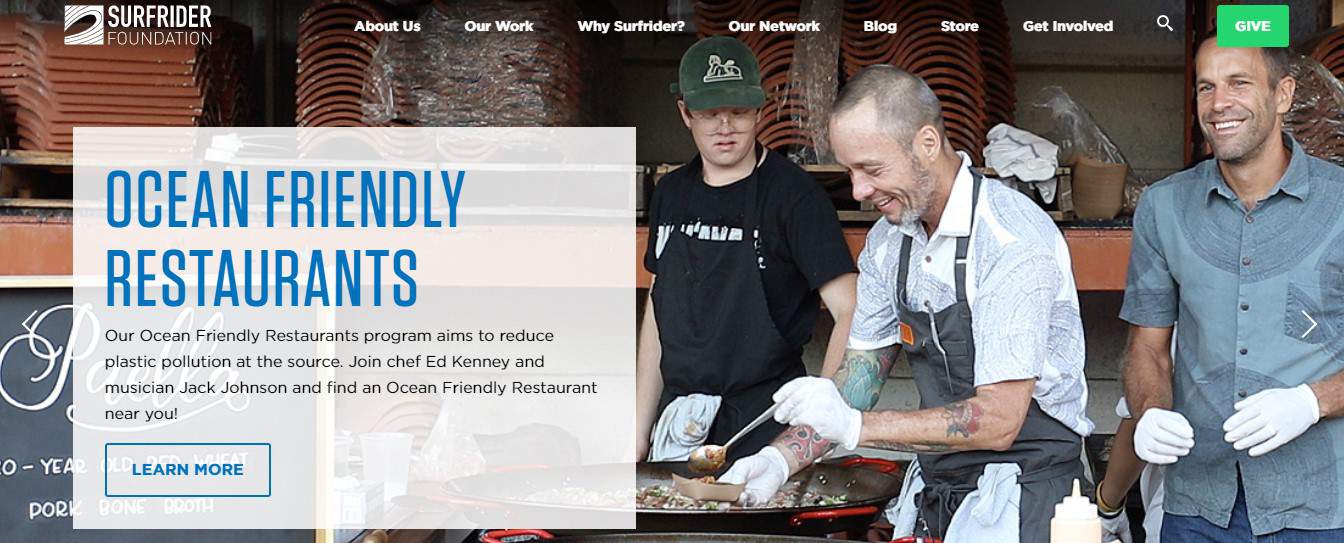
While the spectrum of emotions is colored by the intention and message you’re trying to communicate, its highly important that your visuals are interesting enough to attract the viewer’s attention. For instance, if you’re designing a sports brand website, you’ll use a hero image of someone who is equipped with the brand’s gears. Here, a hero image is the primary image that uses a clear CTA as well as a strong visual language to communicate its purpose. It can also be a way to head for conversion and make a lasting impact on the minds of your audience.
Down below is an example of the hero image from the Surfrider Foundation that uses the hero image in the background and a content box on top of it to enhance the visibility and meaning of its CTA.

10. Pattern Recognition And Scanning
Of all the aims of a user-friendly UX design, uniting the website into whole counts the most. The users expect to see the site with its meaningfulness intact. Instead of using images and irrelevant content, a designer can create a seamless user experience by associating the design with the products, their position, alignment, concept, and navigation, etc.
Users recognize the patterns due to their pre-constructed mental models, where they become accustomed to using navigation in multiple ways. The designer, however, must use patterns that are recognizable by the audience and eases their interaction with the website.
However, before recognizing the pattern, the eyes scan for standard features so the brain can assemble the pattern. In UX design psychology, designers use easily scannable patterns for content and navigation. The most used scan patterns are F and Z.
Both of these patterns use a different approach to displaying and accessing the content. They create visual hierarchy suitable for landing page designs. The F follows a horizontal than the vertical method, which is suitable for text-based websites, whereas the Z approaches a loosely organized zig-zag approach vertically. This model is ideal for the evaluation of landing pages and product relevancy.
While F follows a more descriptive approach, Z pattern is used for pages that are based on simplicity, where it allows the user to take action with direct attention to the CTA. Both are effective tools that also structure your pages. Using both the patterns in their respective manners helps the designers ease access and make the website convenient to use.
11. Dual-Coding Theory
The dual-coding theory is one of the primary and yet fascinating principles used for ages. It suggests that the brain uses two separate yet interconnected systems of communication – verbal and non-verbal. It’s the relationship between these systems that affect learning, memory, and behavior of an individual.
As discussed before, the human mind is hardwired to collect responses from experiences in the past. When someone is describing a rose, you would recall your experiences and interactions with a rose in your life. As per the description, you will automatically imagine a rose with bright red, wide-open petals with thorny stem, serrated leaves, and a strong, pleasant smell. By pairing the words and images, you will find it easier to recall an object from your memory.
In the web design context, you can help your users grip over an idea rapidly by pairing a snappy, precise description with relative visuals of the product you’re describing. Infographics present a great example of the dual-coding system in practice.
While using the content on your website, it’s crucial to balance text with visuals, so the user doesn’t feel overwhelmed with information. Of all the best parts, the dual-coding system makes it easier for the user to store the data and use the visual cues for intuitive experiences.
12. Aesthetic Usability Effect
A design that appears excellent is considered more usable. Why? We tend to forget the issue of usability when the design appeals to us. The law of the Aesthetic usability Effect suggests that good design can conceal the usability issues for some time.
While your users are mesmerized by design and are forgiving the usability sins, you can test the design wireframe at its initial level. If you’ve been past that stage, see how your users are interacting with the design. Are they reaching their purpose in due time? Is it hard for them to find a button and interact with it?
Even if the design is good, you shouldn’t let it hinder you from fixing the underlying problems. Give yourself some time to figure out the usability issues to strengthen the functionality of your site. If it appears good and works better, your website might invite more conversion and even promise more visitors.
13. Law Of The Vital Few
Though the concept applies primarily to economics, Vilfredo Pareto noticed that 80% of Italy’s land is owned by 20% of the population. The Law of Vital Few or the 80/20 rule applies similarly to the UX design, where 80% of the effect comes from 20% of the causes. This principle allows you to focus your research on things that matter the most with regards to usability and interaction.
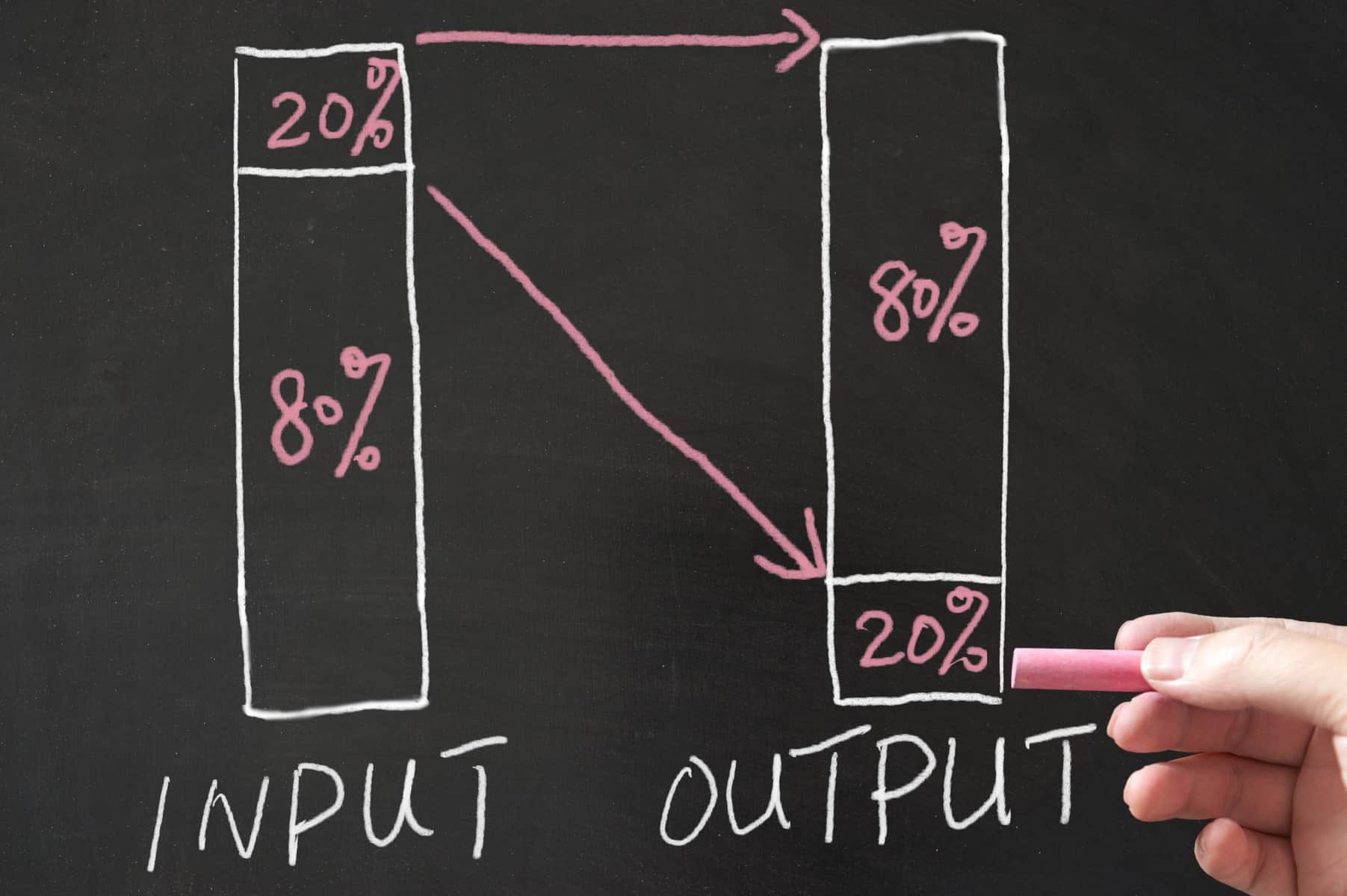

If you can improve the main UX features of your design, you are likely to engage them and earn their loyalty as per this principle. As a designer, your main goal is to narrow the focus down to the leading cause and effect principle while utilizing your resources and attention.
Here, you must figure out the lopsidedness and imbalance of the cause. You have numerous resources to solve several problems, where you can invest your time and effort into the areas of importance. The main goal is to keep the research going on while improving on fixing the fewer problems to create greater impact.
In The End
In this guide, we discussed 13 of the many psychology principles used in UX design. From Hick’s Law to Law of the Vital Few, the combination and interaction of each aim to provide an effective UX design for your website. All of these principles optimize your way to achieving the most convenient user experience for your audience. You can create visual hierarchy, implement the simplicity, present valuable information in the best manner, pull the users to perform a certain action, and provide them with a memorable experience.
While these principles can be baffling for many, customers approach a Dallas web design company that adheres to these principles strictly. However, solo designers can narrow down volumes of information to create a more presentable and valuable content. Understanding these principles and incorporating them in your approach helps you understand what the user actually wants from you.
It should become memorable. It should provide a visual hierarchy. It should encourage the users to take specific actions in time. With these psychology principles, we hope you find it easy to create the most pleasing UX design for your audience.