Creating a strong visual identity is essential for any photography studio or portfolio. A compelling logo not only builds recognition but also sets the tone for your brand's personality. Logos are the first impression potential clients get, and they should reflect the uniqueness, creativity, and professionalism of the photographer. With countless options available, narrowing down the best logo idea can feel overwhelming, so here are twelve inspiring concepts tailored specifically to photography businesses.
TL;DR
Choosing a logo for a photography portfolio or studio is a critical step in branding. This guide outlines 12 creative and strategic logo ideas, from minimalist designs to vintage camera motifs. Whether you're a wedding photographer or a commercial studio, there's something here to suit your style. Thoughtful design elements like typography and symbolism make all the difference.
1. Minimal Monogram
Using your initials or the business name in a sleek, minimalist design can create a modern and professional look. This style works particularly well for high-end portrait and fashion photographers. Focus on clean lines, limited colors, and plenty of white space.
Ideal for: Personal branding, high-end portfolios
2. Camera Outline Icon
Echoing the essence of photography itself, a simple camera outline can instantly communicate your industry at a glance. This versatile identity can be adapted for business cards, watermarks, websites, and packaging.
Ideal for: General studios, beginner portfolios
3. Lens Aperture Symbol
The aperture or shutter symbol uniquely represents the technical aspect of photography. When stylized in a creative way, it becomes a modern emblem of professionalism and precision.
Tip: Consider integrating the aperture with initials or business name for a more layered design.
4. Signature Script Logo
An elegant signature-style font gives a personal and artistic touch to your brand. This logo idea is especially powerful for solo photographers who want to emphasize the personal connection with their work.
Ideal for: Wedding, lifestyle, and family photographers
5. Negative Space Technique
Negative space can be creatively used to form camera components, initials, or even photographic subjects like birds, lenses, or hands. It requires clever design but can yield incredibly creative results.
Pros: Eye-catching, memorable, artistic
6. Vintage Camera Illustration
If your brand leans into nostalgic or traditional aesthetics, consider a hand-drawn or illustrated vintage camera. These kinds of logos evoke a sense of heritage and timeless quality.
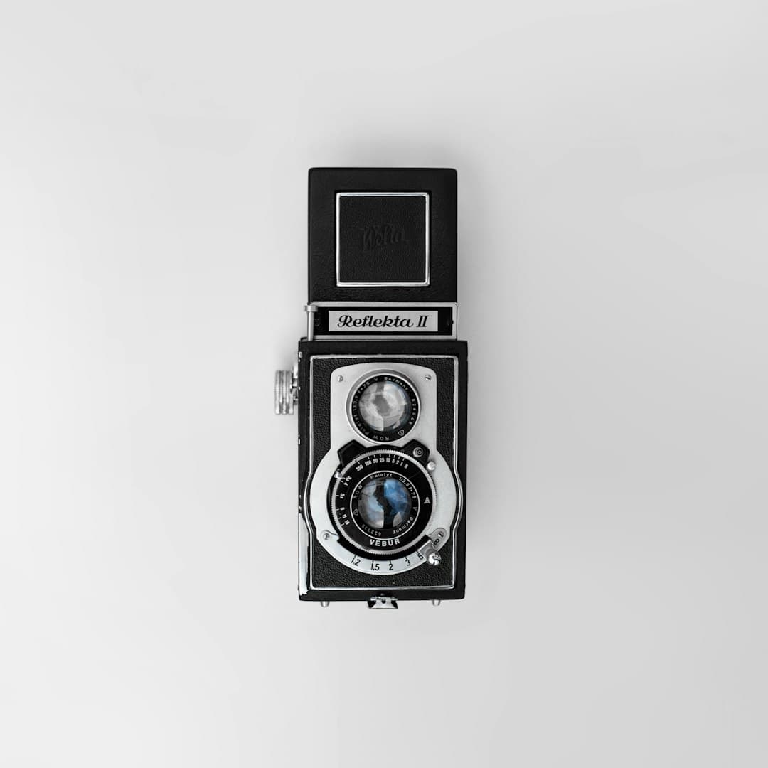
Great for: Film photographers, heritage studios, retro styles
7. Modern Geometric Shapes
Use triangles, circles, or hexagons to build abstract representations of photography tools or processes. With the right color palette and layout, geometric logos appear trendy and tech-forward.
Pro tip: This style pairs well with contemporary branding and digital portfolios.
8. Animal or Nature Motifs
Think outside the lens—logos can include birds, trees, or mountains, all artistically linked to photography. These motifs reflect values like exploration, patience, and perspective, ideal for wildlife or travel photographers.
Perfect for: Nature, landscape, travel photographers
9. Typography-Only Logo
Sometimes, all you need is carefully selected typography. Typography-only logos focus exclusively on the visual power of words, using letter spacing, alignment, and font style to stand out.
Common fonts: Serif for elegance, sans-serif for modernity, script for personality
10. Polaroid Frame Logo
This idea involves using the shape of a Polaroid photo or film frame as the base for the logo. It creates an instant visual reference to photography and adds a nostalgic vibe when used properly.
Useful for: Photo booths, retro studios, casual event photography
11. Color Splash Motif
Include a dynamic splash of color—possibly reminiscent of lens flare or light leaks—in your logo to add creativity and energy. This style showcases a more artistic and conceptual approach to branding.
Good choice for: Artistic photographers, fine art portfolios
12. Combination Mark (Icon + Text)
A combination mark includes both a graphic element and stylized text, making it highly adaptable. You could use the graphic symbol as a watermark on photos and the full logo for marketing materials.
Advantages: Flexibility, consistency, instant recognition
Conclusion
Whether you're presenting a personal portfolio or running a large photography studio, your logo is the foundation of your visual identity. It should tell a story, reflect your core values, and be memorable to your audience. The options listed above provide a wide spectrum of creative directions, from straightforward and clean to intricate and emotional. Choose a design that feels authentic to the vision and voice of your photography business.
Remember:
- Keep it versatile and scalable
- Avoid overly complex elements
- Adapt your logo for both web and print use
FAQ
What makes a photography logo effective?
An effective photography logo is clear, versatile, and aligned with the brand’s identity. It should look great on business cards, websites, and as watermarks across photos.
Should I include a camera in my photography logo?
Not necessarily. While cameras are a direct symbol, they’re also quite common. If you want to stand out, you might consider abstract or symbolic elements instead.
Can I design my photography logo myself?
Yes, with design tools like Canva, Adobe Illustrator, or logo generators, many photographers create their own logos. However, for a more polished and unique look, hiring a professional designer might be beneficial.
How do I use my logo across my photography business?
Use your logo on your website, business cards, social media, photo watermarks, and marketing materials. Consistent usage helps establish brand recognition.
What colors work best for photography logos?
Neutral tones like black, white, gray, and sepia are timeless. However, a pop of personal brand color—like teal, gold, or orange—can help the logo stand out.